UI/UX Redesign for A Short Hike
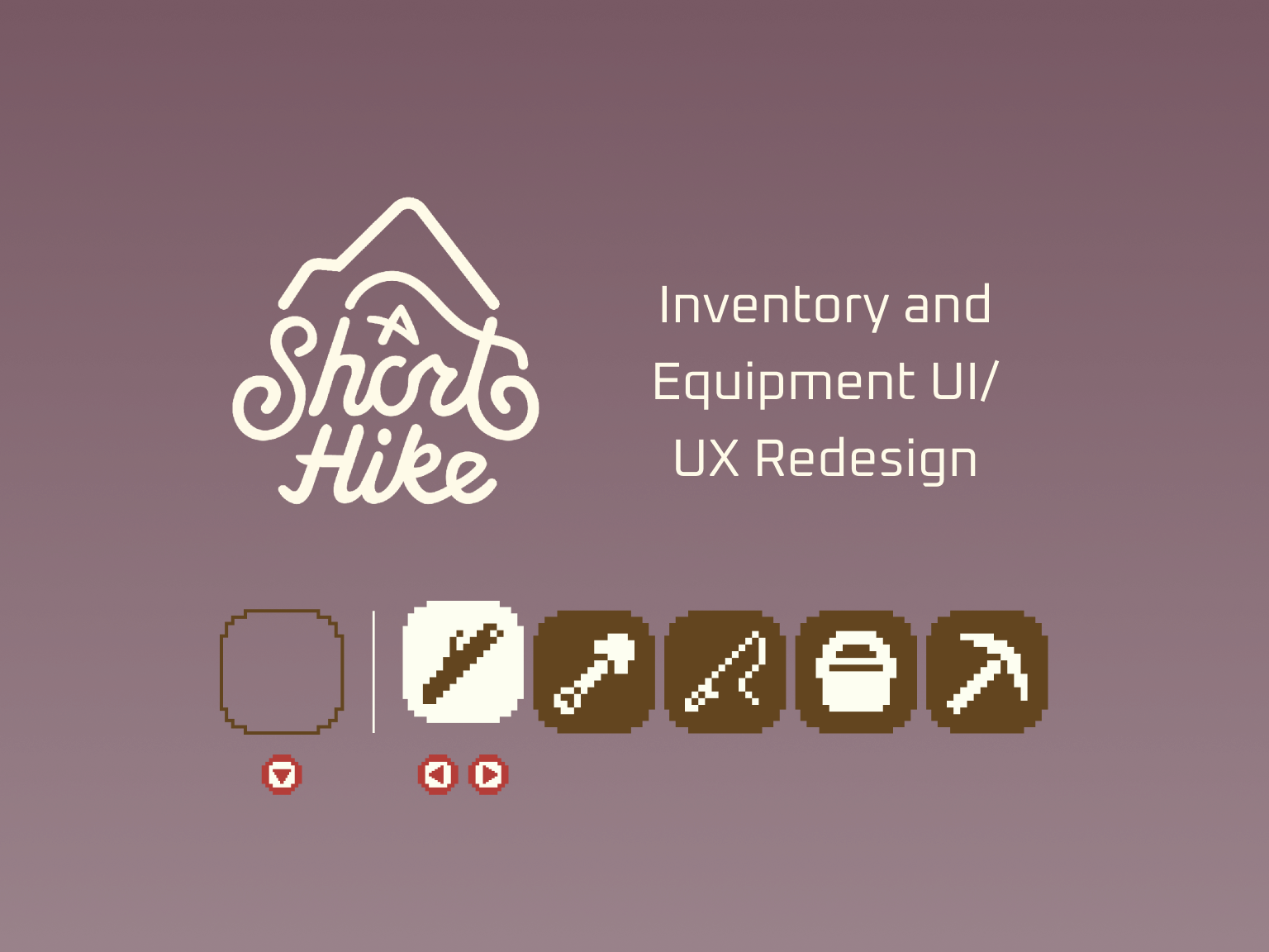
Redesigning the equipment selection feature and the inventory.
Project background
A Short Hike is an open world exploration game, created by Adam Robinson-Yu, with the primary goal of reaching the top of Hawk Peak in order to get cellphone reception to receive an important call. You play as a young bird named Claire who is visiting her Aunt May, a park ranger, at Hawk Peak Provincial Park. As you explore the park you can talk with other characters and collect golden feathers, which allow you to fly further and give you the ability to climb. The game has been widely praised since its original release in 2019.
Redesign goals
Maintain the quirky, easy-going feel of the game while improving the UI/UX of the inventory and equipment selection. I don’t want to overcomplicate the game or take away from its relaxing nature. The current inventory screen is very simple, and I’d like to find a way to add to the game’s cheekiness within the UI design.
Platform
Nintendo Switch
Timeline | Tools
Two weeks | Figma
I first played A Short Hike on the Nintendo Switch in 2021 and immediately fell in love with the game. I tend to gravitate towards cozy games, which allow the player to go at their own pace and explore the world around them. A Short Hike is, as the title suggests, a short game (I finished it the first time in just a few hours), yet I find myself coming back to run, fly, and climb around Hawk Peak Provincial Park despite finishing the main goal.
For my first attempt at a game UI/UX redesign I wanted to choose a simple game in which I experienced a few pain points. The current UI is quite basic, with the inventory, settings, and save options all located on the pause screen. There is no easy way for the player to switch between items without pausing the game and switching items in the inventory, which takes away from the immersive aspect of the game. My first goal for the redesign was to create a shortcut for equipping and switching between usable items. My second goal was to redo the inventory screen. More on that later.
Equipment Selection Redesign
My first step at redesigning the equipping feature was to gain inspiration through competitor analyses. I pulled inspiration from both games that I’ve played before on the Switch and from the Game UI Database. I knew I wanted my solution to show the player’s usable items on the HUD, so I focused on games that had a similar feature. I also wanted the UX to be as smooth as possible, so I knew I wanted button prompts within the items selection feature.
I chose four similar features from different games to use as inspiration.
Low Fidelity Ideation
I was most inspired by Fortnite’s UI. Fortnite’s equipped items feature is unique in that the player can switch between their harvesting tool and the items/weapons they’ve acquired during the match. I liked the button prompts that appear under the currently equipped item and wanted to do something similar for my redesign.
I next experimented with the design in low fidelity. There are five items in A Short Hike that the player is able to use: a stick, a shovel, a fishing rod, a bucket, and a pickaxe. Although the player acquires them at different times, I designed my solution for once the player has gotten all five. Here are some designs I came up with:
I decided on the low fidelity design below. I also created a low fidelity prototype to test out switching between different items. I wanted players to be able to put away items easily using the down arrow and cycle through usable items using the left and right arrows. I used Fortnite as inspiration and outlined and raised the currently equipped item to make it abundantly clear which item the player was holding.
High Fidelity Design
Once I was happy with how the low fidelity prototype was working I began translating my design into high fidelity. I recreated the original icons pixel by pixel. I essentially wanted to reuse what was already there, but make it better. As previously stated, the only way for the player to switch between items is to pause the game and switch items within the inventory. The current pause screen is shown below:
The current inventory simply consists of icons in a straight line, with usable items mixed in with unusable items (such as the cellphone). Redesigning the inventory would come next, but first I took UI inspiration from this screen and translated my low fidelity mockup into the following high fidelity mockup:
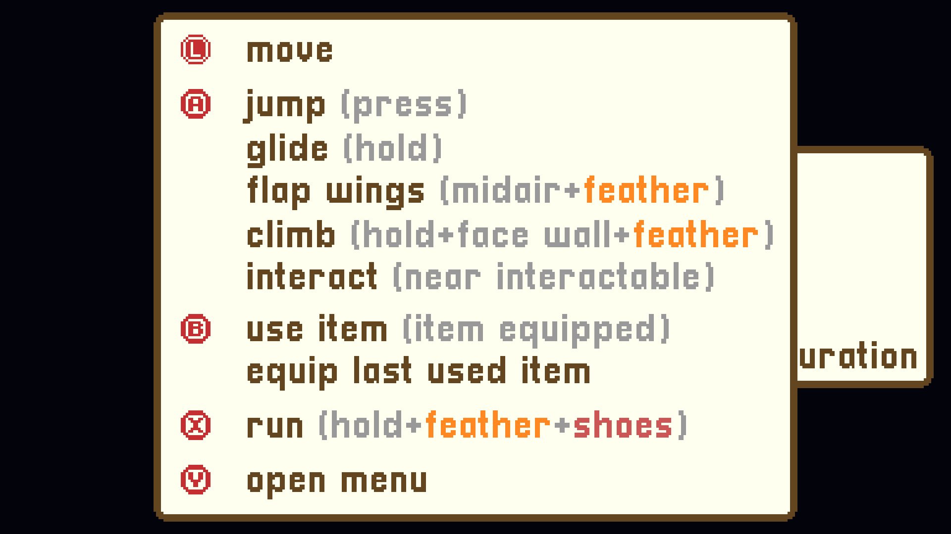
I modeled the button prompts after the bottom prompts already used within the game, as shown in the controls screen below:
High Fidelity Prototype
I decided to place this feature in the bottom left corner of the screen. On a Switch controller, the arrow keypad is located on the lefthand side, so it’s most intuitive to put the corresponding feature on the left side as well. Since the golden feathers were already located in that spot, I decided to move them to the bottom right corner.


